
You’ll choose wall decor that fits when you start with what you already own—your sofa lines, rug patterns, and metal finishes set the clues. Pick a clear lane (modern minimal, eclectic, traditional) so every piece supports the same story. Then decide what the room should feel like, and match scale, layout, and frames to that mood. The tricky part is making it cohesive without looking staged—and that’s where a few smart rules change everything.
Define Your Wall Decor Style
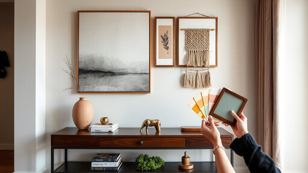
Before you buy anything, define the wall decor style you want to live with every day. Audit what you already love: your furniture lines, metals, woods, and textiles. Then choose a clear lane—modern minimal, organic modern, traditional, eclectic, or gallery-driven—and stick to it as you shop.
Build a quick reference board with 10–15 images so you can spot consistency in color, composition, and scale.
Decide whether you prefer bold artistic motifs or quieter, textural pieces like woven hangings and plaster reliefs.
Factor in cultural influences you genuinely connect with, and source them respectfully through artists, fair-trade makers, or reputable galleries.
Finally, set simple rules—two main colors, one accent, and a consistent frame finish—to keep decisions fast.
Set the Room Mood Your Wall Decor Should Create
Although your wall decor can look beautiful in any style, it should first support the mood you want the room to deliver—calm and restorative, bright and social, focused and streamlined, or cozy and layered. Start by naming the feeling you want guests to notice within seconds, then choose imagery, color, and materials that reinforce it.
Soft landscapes, muted palettes, and airy spacing read tranquil; bold graphics, saturated hues, and playful contrasts energize. For a work zone, pick clean lines and limited colors to reduce visual noise; for warmth, mix textured pieces and organic motifs.
Pay attention to wall decor symbolism—animals, botanicals, and abstract forms carry meaning. Also consider cultural influences so your choices feel respectful, personal, and current without feeling themed.
Choose Wall Decor Size for Your Wall
Once you’ve nailed the mood you want the room to project, scale becomes the tool that makes it feel intentional instead of accidental. Measure your usable wall area, then size your piece to fill about two-thirds to three-quarters of the visual width above furniture.
Keep 6–10 inches between the art and a sofa back or console top, so it breathes. For tall ceilings, go bigger or choose vertically oriented work to avoid a “floating” look.
In art composition terms, match the piece’s weight to the room: bold colors and dense imagery read larger than airy neutrals.
Use smart wall mounting techniques—painter’s tape templates, paper patterns, and a level—to test proportions before drilling. Anchor heavy frames into studs or use rated anchors.
Choose a Wall Decor Layout (Gallery vs Statement)
Next, you’ll choose a layout: build a gallery wall with a consistent theme, frame mix, and grid or organic arrangement, or go bold with a single statement piece that anchors the room.
A statement artwork creates instant impact, while a gallery lets you layer personality and follow current mix-and-match trends.
Either way, you’ll get the best result by balancing scale and keeping spacing consistent so the wall reads intentional, not cluttered.
Gallery Wall Basics
Where should you start when you’re choosing a wall decor layout—go big with one statement piece or build a gallery wall? If you’re leaning gallery, begin with a unifying thread: a shared color palette, consistent frame finish, or repeating artistic techniques like linework, collage, or photography.
Next, map your arrangement on the floor first. Keep 2–3 inches between pieces, and anchor the layout with one “hero” work near the center. Mix sizes for rhythm, but repeat shapes to keep it cohesive.
Choose subjects that reflect your cultural influences—travel prints, heritage textiles, or local art—so the wall feels personal, not random. Finally, hang from the centerline and adjust as you go. Use paper templates and painter’s tape to preview placements without extra holes.
Statement Piece Impact
Ever wonder why a single oversized artwork can make a room feel instantly designed? A statement piece gives your eye one confident destination, so the space reads intentional, not busy.
When you choose this layout over a gallery, you’re prioritizing impact and simplicity—ideal for modern, minimalist, or boutique-hotel looks. Pick art, a textile wall hanging, or sculptural object that reflects your palette and personality, then let it act as the focal point for the rest of the room.
You’ll find styling gets easier: pull colors into pillows or rugs, echo materials in lighting or hardware, and keep surrounding decor quieter. This approach also photographs well, which matters if you share your space online or stage it for resale.
Balancing Scale And Spacing
Although gallery walls and statement pieces feel like opposite choices, both succeed or fail based on the same basics: scale and spacing.
Start by measuring the wall and the furniture below it; aim for scale harmony by keeping art about two-thirds the width of a sofa, console, or bed. If you’re choosing a statement piece, go larger than you think and center it at eye level, then leave generous negative space so it reads intentional, not cramped.
If you’re building a gallery, lock in spacing principles: keep gaps consistent (about 2–3 inches), align outer edges to a clean rectangle, and mix sizes while repeating one unifier—frame finish, mat color, or palette—so the layout feels curated, not chaotic.
Pull Wall Decor Colors and Textures From Your Room
Before you pick a print or frame, take a quick inventory of what’s already working in your room—your wall decor should echo it, not compete with it. Scan your key anchors: rug, sofa, curtains, and any standout art or ceramics.
For smart Color coordination, pull one dominant hue, one secondary shade, and a subtle accent from those pieces, then repeat them in your wall decor so the palette feels intentional, not random.
Next, build Texture contrast to keep the space current. If your room leans sleek (glass, metal, smooth paint), add tactile art like woven textiles, matte paper, or sculptural relief.
If it’s already cozy and layered, choose cleaner, graphic prints to sharpen the look. Stick to two to three textures for cohesion.
Choose Wall Decor Frames and Finishes That Match
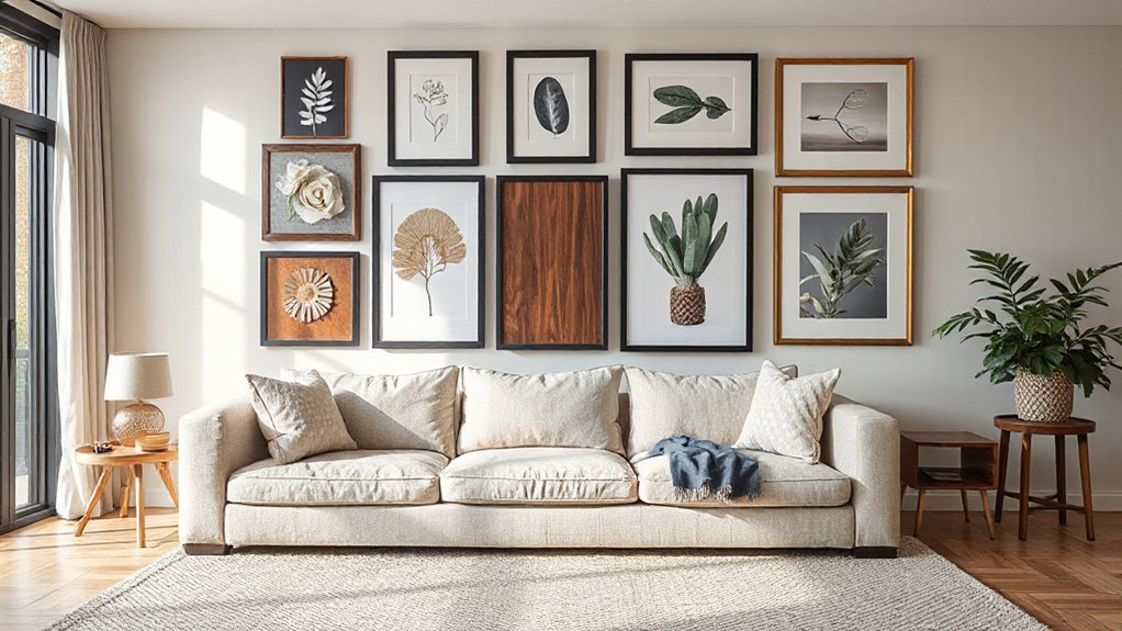
Once you’ve locked in your room’s palette and texture mix, choose frames and finishes that reinforce that same story. Start with frame material: warm woods suit organic, coastal, and Scandinavian rooms; black metal sharpens modern or industrial spaces; brass or walnut elevates mid-century looks. Keep scale consistent—thin profiles feel airy, while chunky frames add weight and structure.
Next, dial in finish options. Matte finishes read contemporary and hide glare, so they’re great for bright rooms. Gloss or lacquer adds polish but highlights fingerprints, best in low-traffic zones. Brushed metals feel current and forgiving; polished metals skew formal.
If you’re mixing frames, repeat one unifier—color, material, or sheen—so the wall looks curated, not chaotic.
Conclusion
When you choose wall decor with intention, your room starts to feel finished—like morning light landing on surfaces that finally belong together. You’ve defined your style lane, set the mood, and picked sizes that fit the wall instead of fighting it. Whether you build a gallery or hang one bold statement, pull colors and textures from what you already love. Match frames and finishes, and you’ll create a cohesive backdrop that feels current, personal, and calm.