
The phrase Victorian home interior gets used loosely — sometimes to mean dark walls and clutter, sometimes a stripped-back terrace with exposed boards and neutral paint, sometimes a full-blown maximalist fantasy of patterned wallpaper and tasselled everything. All of these are, in their way, Victorian. The period ran from 1837 to 1901 and encompassed so many shifts in taste, technology, and social aspiration that pinning it to a single aesthetic is a fool’s errand.
What Victorian interiors share — across the decades, across the social spectrum — is a seriousness about decoration. These were rooms that were meant to say something. About the household’s education, its taste, its respectability. The idea that a room could simply be functional, or that less might be more, wasn’t really available to the Victorian mind. For better or worse, interiors were a performance.
Understanding that is the starting point for doing anything intelligent with a Victorian interior today — whether you’re furnishing a freshly restored terrace or trying to pull some period character out of a house that’s been stripped to the plasterboard.
The Victorian Interior Across the Decades
Early Victorian: Georgian Shadows and Classical Restraint (1837–1860)
Early Victorian interiors carry a heavy Georgian inheritance. The proportions are still classical, the cornicing relatively restrained, the colour palette — by later standards — fairly contained. Floors in principal rooms were polished boards with rugs; halls were tiled. Walls in formal rooms might be hung with flock wallpaper in deep reds and greens, but the overall effect was organised rather than overwhelming.
The fireplace in this period tends towards the marble or slate chimneypiece — columned, symmetrical, with an overmantel mirror above. Cast-iron registers were fitted into the opening, sometimes with simple tiled cheeks, sometimes plain. Furniture sat on formal plans: the room arranged around the fireplace, the table centred, the symmetry maintained.
If you have an early Victorian property — broadly, anything from the 1840s or 1850s — the interiors will have a quieter, more architectural character than the later Victorian periods. Don’t fight it by adding more; work with the restraint.
Mid-Victorian: The Full Flourish (1860–1880)
This is the period most people imagine when they picture a Victorian interior: rich, dark, elaborate, and frankly a little overwhelming by modern standards. Wallpaper became more ambitious — William Morris’s designs enter the picture here, though they were expensive and therefore confined to households of means. Dado rails divided walls into three zones: the dado below (often panelled or painted in a deep tone), the fill above (papered), and the frieze near the ceiling (sometimes a contrasting paper or a painted decorative band).
Colour became bolder. Peacock blue, bottle green, tobacco brown, deep terracotta — these were not rooms that hedged their bets. Curtains were layered: a sheer undercurtain, a heavy outer curtain in velvet or brocade, a pelmet above, and usually a blind behind. The overall effect was deliberately rich, deliberately enclosing.
Floors in better rooms were polished boards with Turkish or Persian-style rugs. Halls and kitchen areas used quarry tile or encaustic tile — the Minton geometric patterns that survive in so many Victorian hallways today.
Furniture was substantial. Overstuffed sofas and armchairs in button-back leather or fabric. Heavy dining tables that could seat ten. Display cabinets, what-nots (corner shelving units for ornaments), and mantelpieces crowded with objects. The Victorian impulse to fill every surface reached its apex in this period.
Late Victorian: Movement and Reaction (1880–1901)
By the 1880s, a counter-reaction was gathering. Several distinct movements emerged, sometimes running in parallel, sometimes in opposition.
The Aesthetic Movement took its cue from art rather than industry — influenced by Japanese design, by classical Greek simplicity, by a rejection of the moral earnestness of mid-Victorian taste. Interiors became lighter. Pale walls, artistic clutter rather than bourgeois clutter, peacock feathers and blue-and-white Delft china. The painter’s palette replaced the upholsterer’s warehouse.
The Arts and Crafts Movement — associated with William Morris (again), Philip Webb, and later C.F.A. Voysey — went further. Against the grain of mass production, it argued for hand-crafted furniture, natural materials, honest joinery, and interiors that felt like they’d been made by human hands rather than a factory. Plain oak, rush-seated chairs, exposed timber structure, unglazed earthenware. Rooms that breathed.
Queen Anne Revival — more of an architectural movement but significant interiorly — brought white-painted panelling, inglenook fireplaces, and a kind of nostalgic homeliness that presaged the Edwardian era.
For anyone living in a late Victorian property — roughly 1880s to 1901 — understanding which of these currents your house reflects (if any) is useful context for decoration.
The Anatomy of the Victorian Room
The Ceiling
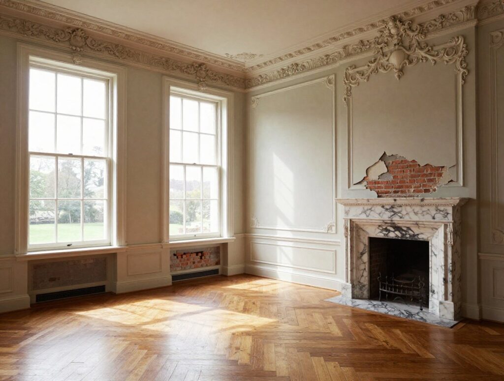
Victorian ceilings in principal rooms were decorated. Cornicing — the moulded plaster profile that transitions from wall to ceiling — ranged from simple run moulded forms to elaborate enriched profiles with egg-and-dart, dentil, or leaf-and-tongue detail. The elaborateness generally tracked the status of the room: the front reception room received the best treatment, the bedrooms rather less.
Central ceiling roses are almost universally original where they survive. In early and mid-Victorian houses they tend to be large and ornate, sized for gas pendant fittings; in later houses they simplify. Where missing, they can be reinstated in fibrous plaster from specialist suppliers — the scale should be proportionate to the room, typically a third to a half of the width of the central pendant light fitting.
Original lime plaster ceilings — on sawn lath — are worth retaining wherever they’re still sound. The texture of a good lime-plaster ceiling is subtly different from modern plasterboard: slightly irregular, slightly warm. It takes paint differently. In a Victorian room it looks right in a way that is hard to put your finger on but immediately apparent.
The Walls
The dado rail — a horizontal timber moulding at roughly chair-back height, typically around 90cm from the floor — is a defining element of the Victorian wall. Its original function was protective (it stopped chair backs marking the wallpaper) but it became an organising principle of decoration. Below the dado, walls were typically darker: painted, panelled, or hung with a more robust paper. Above, the main field of wallpaper. Higher up, a frieze.
Picture rails — a moulded timber profile near the ceiling from which pictures were hung on chains or cords — are another feature worth retaining or reinstating. They’re practical as well as period-appropriate: hanging pictures from them means no wall fixings are needed, which matters when you’re dealing with original plaster.
In rooms where the dado and picture rail survive, retain them. In rooms where they’re missing, reinstatement is straightforward: profiles are widely available from timber merchants and architectural joinery suppliers, and in an unlisted house no permission is required to put them back.
The Floor
Suspended timber boards in principal rooms: the originals, where they survive, are likely softwood — Scots pine or Baltic redwood. Wider boards than modern timber, often with a tight grain that reflects slower-grown Victorian timber. Sanded and finished with oil or hard wax, they look extraordinary. Gap-filling with matching timber slips is a minor job that makes a visible difference.
Encaustic and tessellated tiles in hallways and vestibules: one of the most immediately recognisable features of a Victorian interior. The geometric patterns in terracotta, black, cream, and occasionally burgundy or blue were pressed in clay and fired — the colours go all the way through, which is why they survive so well. Where missing or damaged, replacements are available from salvage yards or from contemporary manufacturers producing accurate reproductions.
Quarry tiles in kitchens, sculleries, and utility areas: similarly durable, similarly worth retaining. They respond well to cleaning with a pH-neutral product and benefit from a period-appropriate linseed oil finish rather than modern acrylic sealers.
Parquet appears in better Victorian properties from the 1880s onwards: typically herringbone or basket-weave pattern in oak, sometimes with a contrasting border. Where it survives, even under carpet or linoleum, it’s usually restorable.
Colour in the Victorian Interior
What the Victorians Actually Used
This is where a lot of modern interpretations go wrong. People either overcorrect into the dark-and-brooding cliché — everything in deep green and burgundy — or they apply Heritage Paint’s latest neutral and call it Victorian. Neither is quite right.
Victorian colour was layered and considered. The Victorians understood that a room had different surfaces — ceiling, cornice, wall above dado, wall below dado, woodwork — and treated them differently. The ceiling was almost always the lightest surface, often a very pale tint or off-white. The cornice might pick up a detail colour from the wallpaper. Woodwork — skirting, architraves, dado rail, window frames — was painted in a mid tone that related to but didn’t match the walls.
Mid-Victorian palettes genuinely were deep: the dyes available (particularly after the introduction of aniline dyes in the 1850s) produced intense, sometimes acid colours. Mauve, magenta, and vivid purple appear in fashionable mid-Victorian interiors alongside the more familiar deep reds and greens.
Late Victorian and Aesthetic Movement interiors shifted towards more muted, artistic tones: sage green, dusty blue, pale terracotta, olive, and — particularly in Arts and Crafts interiors — white-painted woodwork against plain colour-washed walls.
Useful points of reference:
- Farrow & Ball’s historical colour research informs many of their ranges and their website gives useful context
- The Victorian Society publishes guidance on authentic colour schemes
- Historic England’s Informed Conservation series covers specific building types and periods
A practical approach for most people: take one or two colours from period wallpaper (if you’re using it) and use them to inform the paintwork. Or simply look at what reads as natural in the room — Victorian rooms with south or west aspects can handle quite dark colours; north-facing rooms are more demanding.
Pattern
The Victorians were not afraid of pattern. William Morris’s Willow Bough, Strawberry Thief, and Acanthus designs are the most famous Victorian wallpapers and are still produced by Morris & Co. today — as faithful to the originals as commercial production allows. Cole & Son, Sanderson, and Zoffany all produce period-referencing papers that read as Victorian without being slavishly reproduction.
The rule, if there is one, is coherence rather than restraint. A Victorian room with boldly patterned wallpaper, a patterned rug, and patterned curtain fabric can work brilliantly if the colours are related and the scales are varied. What doesn’t work is random pattern collision — the Victorian sense of decoration was always organised, always intentional.
Lighting in a Victorian Interior
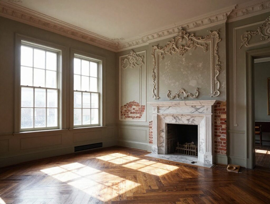
Gas lighting was the dominant technology through most of the Victorian period, with electricity arriving from the 1880s onwards in wealthier households. Victorian light fittings were designed for pools of warm, relatively low light — not the even, bright illumination of modern expectations.
Working with this rather than fighting it produces more characterful Victorian interiors. Ceiling pendants on period-appropriate roses — glass shades, brass fittings, or cast-iron — supplement with wall lights at picture rail level and table lamps. The layered, warm-toned lighting approach suits Victorian rooms and their darker surfaces far better than harsh overhead illumination.
Recessed downlights in original plaster ceilings are a decision that deserves serious thought. Installing them means cutting into fabric that may be original and irreplaceable, and the aesthetic effect in a Victorian room is almost always a mismatch — the flat, directional light quality at odds with the decorative surfaces. A ceiling rose with a pendant fitting, supplemented by floor and table lamps, will always read more naturally.
Furniture and Objects
Period Furniture in a Victorian Room
Original Victorian furniture is widely available, relatively affordable (with the exception of pieces by named makers), and made to a quality that later mass-production rarely matched. Mahogany, walnut, and rosewood were the prestige timbers; painted pine was the vernacular. Button-back upholstery, turned legs, and carved detail characterise mid-Victorian pieces. Later Victorian and Arts and Crafts furniture is simpler: plain oak, through-tenon joinery, rush seating.
You don’t need an entirely Victorian room to live comfortably. Mixing Victorian pieces with contemporary furniture generally works if the contemporary pieces are well-made and the proportions respect the scale of the room. What looks wrong is cheap modern furniture in a Victorian room — not because it’s modern, but because the quality differential is jarring.
Objects and Display
The Victorian interior was populated with objects. Travel souvenirs, family portraits, natural history specimens, ceramic collections, framed prints. The mantelpiece was the primary display surface, layered with clocks, candlesticks, figurines, and photographs. Walls were hung densely — the Victorians picture-hung to the cornice, in overlapping rows that would make a modern curator blanch.
There’s nothing wrong with a more edited version of this — most people don’t want to dust eighty objects and twenty framed pictures. But some density of display reads more naturally in a Victorian room than the spare, object-free surfaces of contemporary minimalism. A few well-chosen pieces on the mantelpiece, a grouping of prints hung at picture-rail height, a decorative ceramic on a shelf: these don’t require commitment to full Victorian maximalism but they acknowledge the room’s decorative heritage.
Kitchens and Bathrooms: The Rooms That Didn’t Exist
Victorian houses had sculleries, not kitchens in the modern sense. They had washrooms and outside privies, not bathrooms. Which means these are the rooms where a Victorian interior scheme has to be invented rather than restored — and they’re also the rooms where most renovation projects spend the most money.
The Victorian-Influenced Kitchen
The most sympathetic Victorian kitchen interpretations work from the building’s palette and proportions rather than from a contemporary trend. Shaker cabinetry in painted timber — particularly in period colours like deep green, navy, or warm cream — sits naturally in a Victorian context. Open shelving in timber above a range, with hanging hooks for pots and pans, references the original scullery aesthetic without pretending to be a museum.
Large-format porcelain tiles and handleless units look incongruous in Victorian terraces. Metro tiles — the simple rectangular white or coloured ceramic tiles that have become a contemporary default — are not Victorian but they’re modest enough to sit quietly. Encaustic-effect floor tiles read better than almost any other option.
The Victorian Bathroom
Roll-top baths on ball-and-claw feet have become almost a cliché of the Victorian bathroom — but they became a cliché because they look right, which they do. Freestanding baths suit Victorian ceiling heights and room proportions in a way that inset panel baths often don’t. Exposed pipework in chrome or antique brass is more characterful than boxed-in plastic; period-style lever taps and shower fittings are widely available.
Walls in metro tile or simple rectangular ceramic with a dark grout, tongue-and-groove panelling to dado height, and a black-and-white encaustic-effect floor: this combination has become familiar but it works because it respects the building’s grammar rather than contradicting it.
Living With a Victorian Interior Today
The honest conclusion about Victorian interior design is that it rewards commitment. Half-measures tend to look muddled — a dado rail with nothing below it, a ceiling rose with no pendant, a marble fireplace against a plain white wall. The Victorian room was a composed whole, and picking individual elements without considering the composition produces a room that feels unfinished.
This doesn’t mean you need to recreate an 1880s interior in forensic detail. It means thinking about each decision — colour, furniture, lighting, objects, floor — in relation to all the others and in relation to the room’s original character.
The houses that do this well have a quality that’s genuinely difficult to achieve any other way. They feel settled, layered, lived-in. They have an atmosphere that isn’t manufactured. The bones of the Victorian house — its ceiling heights, its cornicing, its deep window reveals, its encaustic tiles — are already doing half the work. Your job is just not to undo it.
That’s both easier and harder than it sounds. But the result, when it comes together, is one of the most compelling domestic environments in the British built inheritance. Worth the effort, without a doubt.