
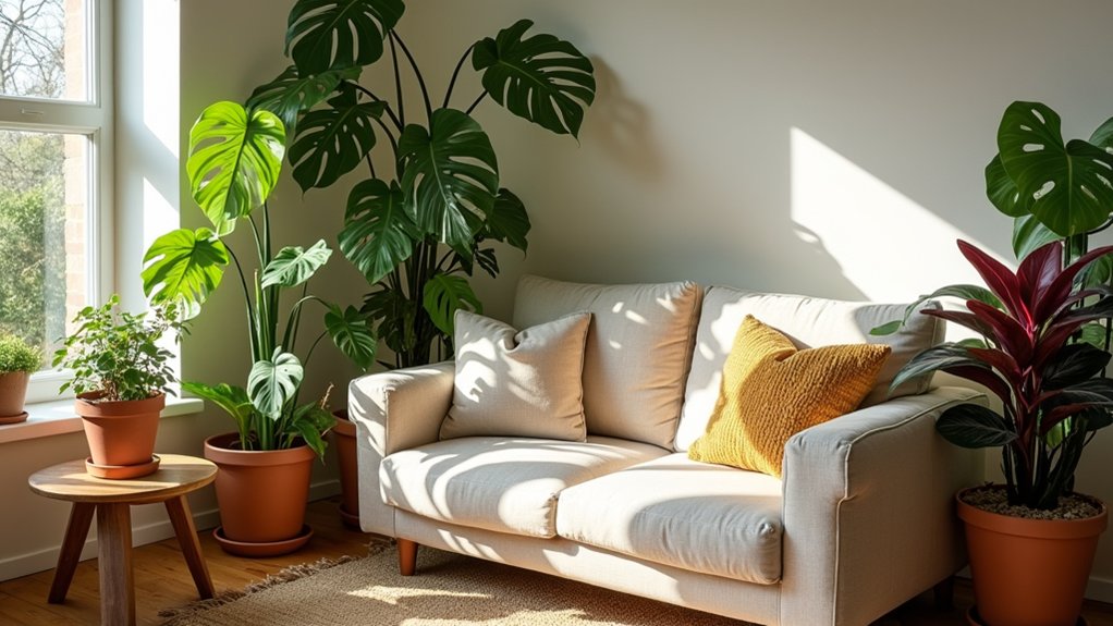

You probably don’t know that leaf finish—glossy, matte, or fuzzy—often changes a room’s “colour” impact more than the plant’s actual hue. Start by matching plants to your light, then stick to a tight palette and mix in contrasting shapes: strappy, round, lobed, and trailing. Use one bold foliage plant as a focal point and support it with quieter greens in odd-numbered groups. The key detail most people miss is…
Start With Your Light and Room Needs
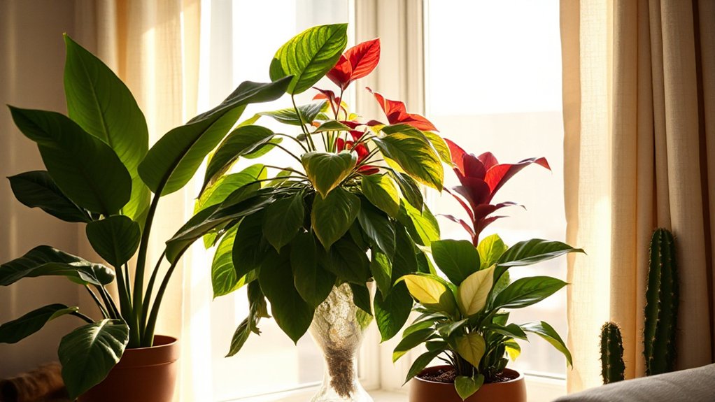
Before you fall for a plant’s colour or leaf shape, take a quick read on your space: which direction your windows face, how many hours of bright (not scorching) light you actually get, and whether the room runs warm, cool, or drafty. These Lighting considerations decide if you’ll get crisp variegation, richer greens, or stretched, leggy stems.
South and west windows suit sun lovers; filter with a sheer to prevent scorch. East light supports most medium-light plants; north light calls for low-light picks or a grow light.
Next, check Room compatibility: bathrooms boost humidity for ferns, kitchens swing warmer, and AC vents stress tropicals. Measure light at plant height, then place accordingly and rotate weekly.
Choose a Simple Colour Palette for Houseplants
Once you’ve matched plants to your light and room conditions, lock in a simple colour palette so your collection looks intentional instead of chaotic. Pick two to three dominant tones and repeat them across the room for Color harmony—think deep green + cream, or green + blush + burgundy for a current, warm look.
Use variegation as your “pattern” and keep it consistent: either mostly white-splashed leaves or mostly lime-chartreuse accents, not both.
Anchor the scheme with one solid-green plant, then add one accent plant that echoes a room element like a rug stripe, artwork, or throw.
Keep pots and saucers in one finish family (matte black, warm terracotta, or stone) so the plants’ natural Texture contrast feels curated, not busy.
Add Instant Texture With Leaf Shapes and Finishes
Once you’ve set a simple colour palette, you can add instant texture by mixing leaf shapes—think broad monstera cuts next to strappy dracaena or ruffled calathea.
Pair contrasting finishes for a designer look, like glossy rubber plant leaves against matte, velvety philodendron or fuzzy peperomia.
Keep the mix intentional: repeat one shape or finish across the grouping so it reads curated, not chaotic.
Mix Leaf Shapes
Even if your plant shelf already has plenty of green, mixing leaf shapes gives it instant texture and a more styled, trend-forward look. Pair broad, paddle-like leaves (rubber plant, philodendron) with narrow straps (snake plant, dracaena) and fine, feathery fronds (fern, asparagus fern) so the silhouettes read as layered, not flat.
Use one “hero” shape per cluster, then add two supporting shapes at different scales. Repeat a curved outline or pointed tip across the shelf to keep it cohesive.
Work in variegated patterns for visual rhythm, and pay attention to leaf margins: ruffled begonias, serrated calatheas, or clean-edged pothos change the vibe fast. Space pots so each profile stays visible.
Contrast Leaf Finishes
Because light hits each plant differently, contrasting leaf finishes gives your shelf instant depth without adding more pots. Pair Glossy finishes with matte textures so highlights and shadows read like layered fabric.
Put a waxy-leaved philodendron or rubber plant beside a velvety peperomia or begonia; you’ll get sheen next to softness, even in low light. Angle the glossy plant toward a window to catch reflections, then tuck the matte one slightly back to absorb glare and look richer.
Keep leaf sizes similar if you want a clean, modern look, or mix big glossy leaves with small matte ones for a curated, maximalist vibe.
Wipe glossy leaves weekly; misting can spot them, while matte plants prefer gentle dusting.
Pick Bold Foliage Houseplants for Focal Points
Choose statement foliage like a variegated monstera, calathea, or croton when you want a plant to act as the room’s visual anchor. Place it where sightlines naturally land—by the sofa, at an entry, or in a bright corner—and give it breathing room so the silhouette reads.
Then pair surrounding plants with simpler greens and contrasting finishes (glossy vs. matte, fine vs. broad) to make the focal leaves pop without looking busy.
Statement Foliage Choices
If your room feels flat or overly neutral, a bold foliage plant can act like living artwork and instantly set a focal point. Choose species with graphic foliage patterns, like Calathea orbifolia’s striping or Alocasia ‘Polly’ with sharp veining, for high-contrast texture that reads from across the room.
For modern, designer vibes, lean into leaf variegation: Monstera ‘Thai Constellation’ delivers creamy speckles, while Philodendron ‘Birkin’ adds pinstripes that look tailored.
Want sculptural impact? A Bird of Paradise or rubber plant brings big, architectural leaves with a glossy finish. Keep the look intentional by matching leaf shape to your style—rounded for soft minimalism, spiky for edgy contemporary—and pick one “hero” plant rather than several competing statements.
Placement For Maximum Impact
While a bold foliage plant already brings drama, its placement determines whether it reads as a deliberate focal point or background clutter. Start by choosing one “hero” zone: the entry, sofa corner, or dining sightline.
Use Window placement to backlight leaves and sharpen silhouettes, but pull the pot 6–18 inches off the glass to prevent scorching and drafts.
Anchor large plants on the floor with a simple stand so the canopy hits eye level when you’re seated.
For medium plants, use Shelf styling: stagger heights, leave negative space around the boldest leaf shape, and keep the pot finish consistent so foliage stays the headline.
Rotate the plant weekly for even growth, and wipe leaves so texture reads from across the room.
Pairing Colors And Textures
Once you’ve nailed placement, the next win comes from pairing leaf color and texture so your bold foliage plant reads intentional, not random. Use Color theory to choose one dominant hue and one supporting accent—think burgundy rubber plant with a chartreuse pothos, or a silvery scindapsus beside deep-green monstera.
Keep the palette tight so the leaves feel like decor, not clutter.
Then build texture contrast. Match glossy, broad leaves with fine, matte foliage (philodendron against asparagus fern), or set velvety anthurium near spiky sansevieria.
Repeat the same texture twice across the room to create rhythm, and break it once with a statement plant.
Finish with a neutral pot to let foliage lead.
Use Flowering Houseplants for Seasonal Colour
A few well-chosen flowering houseplants can instantly shift your space with the seasons, adding punchy colour and fresh texture without changing your whole décor. Build Seasonal bloom arrangements by rotating standout bloomers: kalanchoe and primrose for winter, orchids for spring, anthurium for summer, and chrysanthemum for fall. Keep pots consistent so the colour feels intentional, not chaotic.
Nail Flowering plant care to keep blooms coming. Place plants in bright, indirect light, and turn pots weekly for even growth. Water only when the top inch dries, then drain fully to avoid bud drop.
Feed lightly every 2–4 weeks during active growth, and deadhead spent flowers to redirect energy into new buds and leaves.
Layer Tall, Medium, and Trailing Houseplants
Even if you stick to a tight colour palette, you can make a room feel richer by layering houseplants at three heights: tall “anchor” plants to frame a corner, medium plants to fill the sightline on shelves or consoles, and trailing plants to soften edges and add movement.
Choose a sculptural floor plant like rubber tree or dracaena for the anchor, then add a textured mid-layer like peperomia, begonia, or bird’s-nest fern. Finish with pothos, heartleaf philodendron, or string of turtles to cascade from a high shelf.
Match plant care needs: keep light and watering schedules similar so you don’t overthink routines. Dial in soil selection too—use a chunky, fast-draining mix for aroids, and a finer, moisture-holding blend for ferns. Rotate weekly for even growth and consistent color.
Group Houseplants Like a Stylist (Odd Numbers + Spacing)
Because a single plant rarely reads as “designed,” you’ll get a more styled, intentional look by grouping houseplants in odd numbers (three or five) and leaving clear, breathable spacing between pots.
Start with one anchor plant, then flank it with two supporting shapes to create visual balance. Keep a consistent gap—about 2–4 inches—so each silhouette stays legible and leaves room for air flow and watering access.
Vary leaf size or finish (glossy vs. matte, fine vs. bold) but repeat one element, like similar leaf tone, to unify the plant arrangement.
Angle pots slightly toward the viewing side, and step back often: if one plant dominates, shift it a few inches, not the whole cluster.
Aim for negative space, not clutter.
Boost Colour With Pots, Stands, and Cachepots
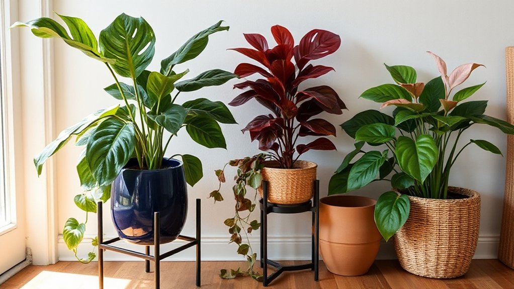
When your foliage leans mostly green, shift the colour story to the containers by mixing pots, stands, and cachepots like décor layers. Choose one bold hue (cobalt, terracotta, or butter yellow) and echo it twice across the room for a pulled-together look.
Use Decorative pot choices to add texture: ribbed ceramic for shine, matte stoneware for softness, or woven seagrass cachepots for warmth. Keep the grow pot inside a cachepot so you can swap colours seasonally without repotting.
Play with Stand styles to change height and mood—hairpin metal feels modern, turned wood feels vintage, and tripod stands read mid-century. Add a low saucer or plant tray in a contrasting glaze to finish the palette and protect surfaces.
Avoid the 7 Most Common Houseplant Styling Mistakes
Although a few well-chosen plants can instantly elevate a room, most “messy” or underwhelming setups come down to the same styling slip-ups—clashing pot scales, awkward spacing, and light mismatches that make foliage look dull instead of lush.
Avoid seven common mistakes:
1) Oversized pots that dwarf plants; size up one step only.
2) Mixing too many finishes; repeat one metal or glaze.
3) Lining plants like soldiers; stagger heights and depths.
4) Ignoring negative space; leave breathing room on shelves.
5) Hiding texture; front-load fuzzy, fenestrated, or variegated leaves.
6) Skipping Plant care basics; match species to window direction.
7) Forgetting Maintenance tips; group by watering needs and add drip trays.
Rotate weekly for even growth.
Conclusion
When you style houseplants with intention, your room doesn’t just look “nicer”—it looks magazine-styled overnight. Match plants to your light, then stick to a tight colour palette so every leaf feels curated. Mix glossy, matte, and fuzzy foliage for texture you can practically feel from the doorway. Add one bold focal plant, layer heights, and group in threes with breathing room. Finish with coloured cachepots and stands—instant designer depth.