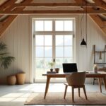

You can make a modern kids’ space feel larger and calmer by starting with a base colour that nails the right undertone, then layering in a clean palette—warm neutrals, airy pastels, or one bold, controlled hit. Use the 60–30–10 rule to keep it balanced, and let trim, oak, and textured textiles do some of the heavy lifting. The key is where you place colour, and what you save for later…
Choose a Base Wall Colour and Undertone
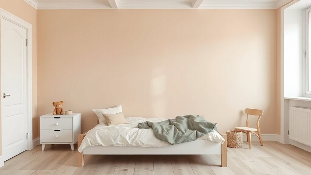
Whether you’re designing a nursery nook or a teen hangout, start by locking in a base wall colour and its undertone, because that choice sets the room’s brightness, perceived size, and the way every accent (from bedding to toys to artwork) reads in different light. Test swatches on two walls and view them morning, afternoon, and lamp-lit; undertones shift fast in small spaces.
If the room runs cool, choose a warm-leaning neutral to keep it cosy; if it runs sunny, a cooler base can calm glare. Match wall texture to function: smoother walls read cleaner and larger, while subtle texture hides scuffs. Pick a paint finish that works hard—eggshell for wipeability, matte for low-shine serenity.
Pick a Modern Kids’ Room Palette Style (Neutral, Pastel, Bold)
Once you’ve nailed your base wall colour and undertone, choose a palette style that drives the room’s mood and how “big” it feels at a glance: modern neutral, soft pastel, or confident bold.
Neutrals (warm greige, oat, soft stone) keep floors, storage, and art looking sleek, and they visually stretch tight rooms with clean contrast.
Pastels (dusty lilac, misty blue, muted peach) feel airy and calm, especially with matte finishes and pale timber that bounce light.
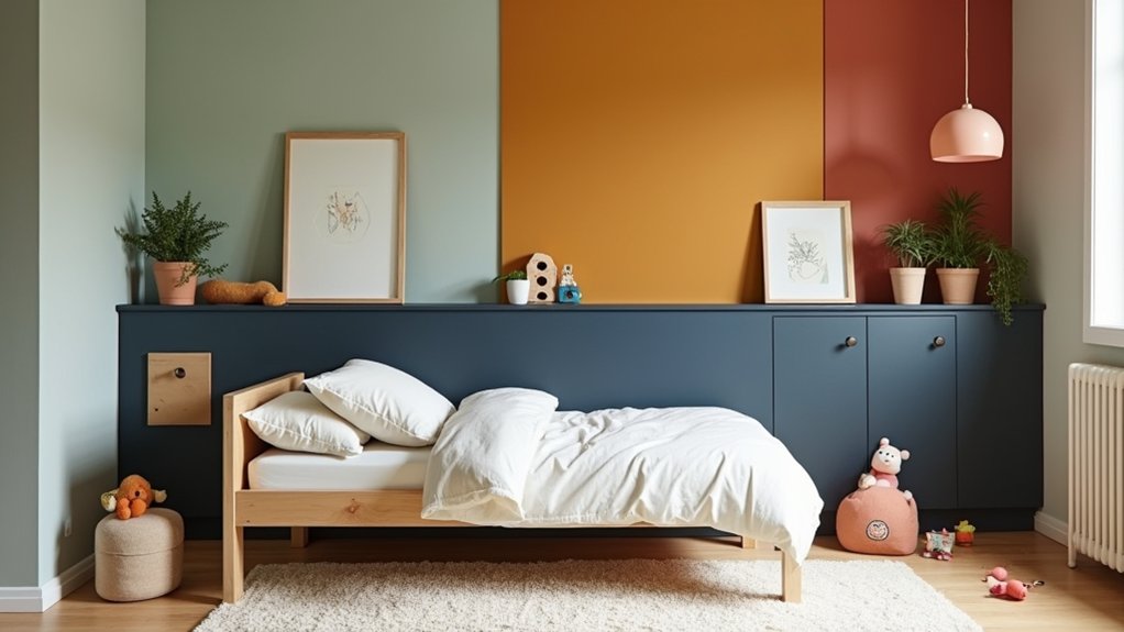
Bold palettes suit a Teen bedroom or high-energy zones when you anchor them with one deep shade (ink, forest, oxblood) and crisp trims for sharper lines.
Add playroom accents through movable pieces—stackable bins, graphic rugs, and colour-blocked cushions—so the look stays current as tastes shift.
Use the 60–30–10 Rule for Kid-Friendly Balance
Because kids’ rooms need to flex between sleep, play, and study, the 60–30–10 rule gives you a modern way to keep colour balanced without shrinking the space. Put your 60% on the largest planes—walls, rug, or built-ins—so the room reads clean and open.
Use 30% on secondary zones like bedding, curtains, and storage fronts to define activity areas without visual clutter.
Reserve 10% for punchy accents—desk chair, art, lamp, or drawer pulls—so you can swap trends fast.
Apply Color psychology: keep the main tone steady, then steer mood with the 30% zone and energise with the 10%.
Finish with lighting techniques: match bulb temperature to your palette and spotlight accents to guide focus.
Warm Neutrals That Calm Modern Kids’ Spaces
While bold colour can look cool on Pinterest, warm neutrals—think soft greige, oatmeal, clay beige, and creamy off-white—make a modern kids’ space feel calmer and visually bigger without going flat. You’ll bounce light around small rooms, soften visual noise, and create a backdrop that still feels design-forward.
Keep walls in a warm off-white, then layer contrast with oak, cane, and textured linens so the room reads intentional, not bland. For creative accent wall ideas, paint a low “wainscot” block in clay beige or a rounded arch behind the bed to zone play and sleep without adding clutter.
Choose matte or eggshell for scuff control and easy touch-ups. Prioritise sustainable paint options with low-VOC formulas and washable finishes, so the space stays healthier and looks crisp longer.
Pastel Colour Ideas That Still Feel Modern
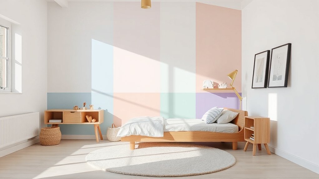
If you want colour without the chaos, modern pastels deliver—think dusty blush, misty sage, powder blue, and buttery lilac that feel fresh rather than sugary. Keep the palette grounded with warm white trim and light oak to maximise brightness and make small rooms feel bigger.
Use pastels in repeatable, compact moves: a two-tone wardrobe, a painted bookcase back panel, or colour-blocked storage bins that organise clutter fast. For a streamlined look, try Monochrome schemes in one pastel family, then shift intensity from walls to textiles to art.
Add Vibrant accents sparingly—cobalt knobs, tomato-red picture frames, or a neon desk lamp—to sharpen the modern edge. Finish with matte paint and simple geometric prints so everything reads calm, current, and kid-proof.
Bold Feature Walls: Best Placement and Patterns
To make a modern kids’ room feel designed—not just decorated—use a bold feature wall to anchor the layout and control visual energy. Place it behind the bed to frame the sleep zone, or on the wall you see first to create instant impact without overloading the room.
In tight spaces, choose the longest uninterrupted wall so the pattern reads cleanly and makes the room feel larger.
Skip random scatter prints; go graphic and intentional. Try oversized stripes to stretch height, a color-block grid to organise play corners, or a curated wall mural that echoes the room’s theme without turning chaotic.
Add tactile depth with textured paint in a matte finish to reduce glare and hide scuffs. Keep adjacent walls crisp and light for balance.
Age-by-Age Colour Ideas (Toddlers to Teens)
Because kids’ needs shift fast, your colour plan should flex by age—calming and wipeable for toddlers, high-contrast and energising for preschoolers, smarter mid-tones for school-age kids, and moodier, more grown-up palettes for teens.
For toddlers, lock in Nursery calming with soft sage, warm greige, or dusty blush in an eggshell finish that cleans fast and hides scuffs.
For preschoolers, use crisp white plus punchy primaries in tight zones to sharpen play areas without shrinking the room.
For school-age kids, choose mid-tone blues, clay, or olive; they feel modern, reduce glare for homework, and work with changing interests.
For teens, go Teen bold: inky navy, charcoal, or deep plum, balanced with one light wall to keep ceilings feeling higher.
Tie Colour to Modern Furniture, Textiles, and Decor
While your paint sets the mood, modern furniture and textiles lock the palette into a cohesive, space-smart look. Start with one dominant wall colour, then repeat it in compact doses: desk chair piping, storage bin fronts, and a framed print to keep visual clutter low.
Choose Furniture finishes that echo your undertone—warm oak for earthy greens, matte white for crisp pastels, black metal for saturated brights.
Next, use Textile patterns to add energy without shrinking the room. Go micro-scale checks, thin stripes, or tonal dots on curtains and bedding, then keep the rug quieter so the floor reads larger.
Layer one “pop” accessory—lamp, cushion, or peg rail—in a high-contrast accent. You’ll get a modern, flexible scheme that adapts as tastes change.
Conclusion
You don’t need a huge room to nail modern colour—just a smart plan. Start with a warm neutral or airy pastel, then use the 60–30–10 rule so the space feels styled, not noisy; designers often lean on it because it keeps 90% of the room calm. Think of colour like packing a carry-on: essentials first, one bold “statement” last. Keep trims warm white, add oak, and let textiles evolve as they grow.