
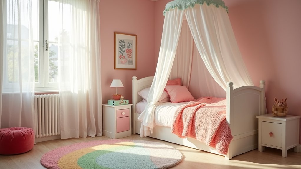

You’re not just picking a pretty paint colour—you’re shaping how her room feels now and how it’ll age with her. Start with a calm base like warm white, blush, lavender, or sage, then control energy with a single bright accent in coral or turquoise. If you want a designer look, consider two-tone walls or subtle texture and plan lighting early. The key is choosing what won’t date fast… but where do you start?
How to Choose a Girls’ Bedroom Colour Scheme
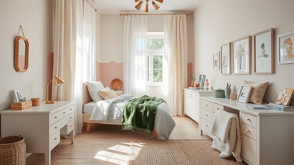
Whether you’re starting from scratch or rejuvenating what’s already there, choosing a girls’ bedroom colour scheme works best when you treat it like a design brief: begin with the room’s natural light and size, decide the mood you want (calm, playful, modern), then anchor everything with one “hero” element such as a duvet cover, rug, or wallpaper.
From there, build a tight palette: pick a dominant wall colour, a secondary tone for furniture or textiles, and one accent for energy. Use undertones to keep it cohesive—cool whites with lavender, warm whites with blush.
Add depth with matte walls and satin trim. Artistic wall murals replace busy patterns while still delivering character.
Finish with cozy window treatments that echo your accent colour and soften glare.
Colour Schemes by Age (Toddler to Tween)
As your child moves from toddlerhood to the tween years, the best bedroom colour scheme shifts from high-contrast, comfort-first hues to layered, personality-driven palettes that can evolve without a full repaint.
For toddlers, choose two to three bold, friendly colours with crisp white trim to keep the room readable and calming; use washable finishes and limit accents to one feature wall or rug.
In preschool years, introduce a tighter theme: one main colour, one supporting hue, and a grounded neutral for furniture.
By early elementary, add depth with muted mid-tones and pattern mixing while keeping ceilings and doors light.
For tweens, let her set the direction—within boundaries—so gender preferences and cultural influences show through art, textiles, and swapable decor.
Pastel Bedroom Colour Schemes (Modern, Not Babyish)
Pastels can read polished and current when you treat them like sophisticated mid-tones instead of nursery brights. Choose dusty blush, muted lilac, misty sage, or powdery blue with a greyed base, then anchor them with warm white trim and matte black or light oak accents.
Use Color psychology: blush supports comfort, sage steadies focus, and lilac feels creative without overstimulating.
Control sweetness through finish and layering. Paint walls in a soft eggshell, then add wall textures like limewash, subtle vertical panelling, or a tonal wallpaper with micro-geometrics to create depth.
Keep bedding crisp—white, oatmeal, or tonal stripes—and repeat one pastel in art, a rug, and one statement lamp. You’ll get modern calm, not babyish.
Bright Bedroom Colour Schemes (Fun Without Chaos)
Bright colour schemes work best when you treat them like deliberate design moves, not wall-to-wall saturation. Choose one hero hue—cobalt, tangerine, or hot pink—and let it lead on a single wall, headboard, or rug. Then repeat it in smaller accents for cohesion.
Use Color psychology to keep energy upbeat but controlled: pair brights with crisp white trim, pale wood, or clear acrylic so the room breathes. Limit your palette to three colours plus black for definition, and pick one pattern scale (bold stripe or oversized floral) to avoid visual noise.
For Mood enhancement, balance warm brights with a cooler counterpoint—coral with mint, sunshine yellow with periwinkle—so the space feels playful, not frantic. Add matte finishes to reduce glare.
Neutral Bedroom Colour Schemes With Warmth
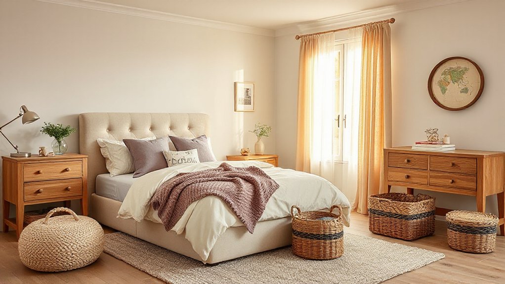
Even if you prefer a calm, neutral palette, you can still build warmth by choosing undertones that read creamy, sunlit, and tactile rather than flat beige. Start with soft oat, ivory, or warm greige on the walls, then add wall texture through limewash, subtle plaster, or a linen-look wallpaper to keep the room from feeling bland.
Layer in blush-tinted whites, sandy taupes, and muted apricot accents for a modern, girl-friendly softness. Choose furniture finishes that amplify glow: honey oak, matte birch, or painted warm white with brass or champagne pulls.
Ground everything with natural-fiber rugs and boucle bedding, then repeat warm metals in lighting to make the scheme feel intentionally curated and cozy.
Two-Tone Bedroom Colour Schemes That Add Style
Once you’ve nailed a warm neutral base, a two-tone scheme gives the room instant definition without sacrificing softness. Pick a grounded lower colour (clay, muted teal, soft cocoa) and a lighter upper tone (ivory, blush, misty lilac) to keep the look youthful yet polished.
Use a crisp horizontal line, a gentle arch, or a half-height wrap to make the split feel intentional.
Lock the palette in with Bedding color coordination: choose one dominant hue, one supporting hue, then repeat them in a throw, sheets, and a small pattern. Finish with Matching wall art that echoes both tones—think simple prints with shared undertones—so the scheme reads curated, not chaotic, even as tastes change.
Accents, Light, and Room Size (So It Lasts)
To make a girls’ bedroom color scheme last, you’ll pick accent colors that can mature with her—think swap-friendly textiles, art, and hardware in on-trend tones.
You’ll also test your paint under daylight, warm bulbs, and evening shadows because lighting can shift a “soft blush” into peach or a “cool grey” into blue.
Finally, you’ll scale shades to the room: lighter, cleaner hues open small spaces, while deeper colors and higher-contrast accents feel intentional in larger rooms.
Accent Colors That Grow
Because your daughter’s tastes will shift faster than the furniture, choose accent colors that can flex with age—think swap-friendly layers like pillows, rugs, art, and bedding rather than a full-room commitment.
Start with a calm base (warm white, soft greige, pale blush), then rotate accents to match her phase: dusty lavender for quiet focus, teal for confidence, sunflower for energy—lean on Color psychology to steer mood without repainting.
For furniture coordination, repeat one undertone across wood, metal, and textiles (gold-warm or silver-cool) so new accents still look intentional.
In smaller rooms, keep bold hues to 10–20% of what you see: a statement quilt, two framed prints, a desk chair.
Choose washable fabrics and removable decals for stress-free updates.
Lighting’s Effect On Color
Those swap-friendly accents won’t look the same under every bulb, so treat lighting as part of your color scheme, not an afterthought. Warm LEDs (2700–3000K) make blush, peach, and buttery yellows feel softer, while cooler temps (3500–4000K) sharpen mints, lilacs, and crisp whites. To avoid surprise shifts, test paint and textiles at morning, afternoon, and bedtime with the fixtures you’ll actually use.
Layer lighting: a ceiling fixture for even color read, a task lamp for homework clarity, and a dimmable bedside glow for Mood enhancement. Pick high-CRI bulbs (90+), so prints, rugs, and art stay true.
Choose Eco friendly lighting—LEDs with long lifespans and low heat—to protect fabrics and keep tones consistent.
Scaling Shades To Space
Even when you’ve nailed a palette, the room’s size and light level decide how intense each shade should feel, so scale your color scheme like you’d scale furniture.
In small bedrooms, keep walls in lighter tints (blush, buttercream, misty blue) and push saturated color into accents—headboards, bedding, lampshades—so it doesn’t close the space.
In larger rooms, you can anchor with a deeper mid-tone on one wall or built-ins, then balance with airy trims.
Use Color psychology deliberately: calmer greens for sleep, upbeat corals for play, and soft lavenders for comfort.
Match paint finishes to wear: matte on ceilings, washable eggshell on walls, and satin on trim for wipeable durability and a modern glow.
Conclusion
Choose a colour scheme that feels fun now and still suits her later. Start with polished pastels or warm neutrals, then layer bold, bright bursts through bedding, art, and accessories. Try tasteful two-tone walls or subtle texture to add depth without drama. Balance every palette with warm white and smart, soft lighting so the room stays calm, cosy, and current. When you scale colour to room size, you’ll create a space she’ll love.